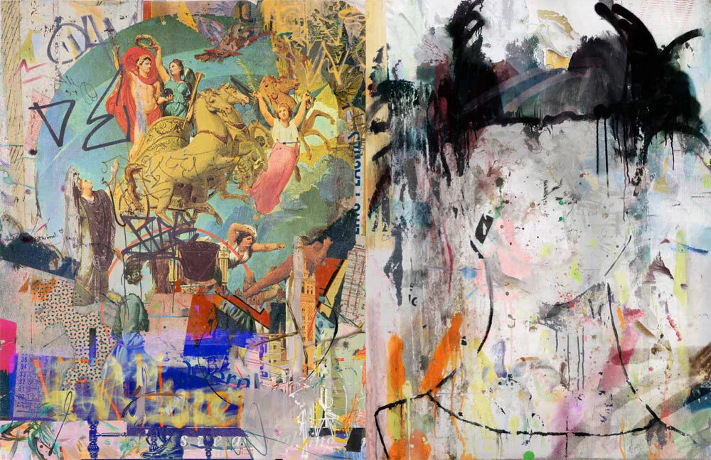
The submitted photograph was painted over, retouched, color adjusted and brought into an overall harmony. Gradually, watercolors were used to create colored areas that appear in the picture covered and discovered history 182 and then brought them into harmony layer by layer with the revised photograph. Yellow tones and blue tones form the initial contrast and result in green in the middle, which gently rounds off the composition. A few purple and pink tones counteract the composition above the Gloriette. Symbolically for this romantic spot, a fragmentary, slightly open heart was inserted into the composition, which forms the bracket to the classical work on the far right. On the side of St. Stephen's Cathedral, an Art Nouveau ornament from the Wiener Werkstätten was suggested and supplemented with a free, upward-facing drawing that curves around the tower. Stronger enamel colors and spray paintings were added to create additional depth. The Ferris wheel at the top right is supposed to give the composition a lightness and closes in the line of vision at the bottom left with the girl and the mother's arm. Raster and spray dots, drops of water color as well as a few décollages and free chalk work in light and dark finished this work.
Thank you for letting me create this picture for you.
Commissioned Artwork Graz
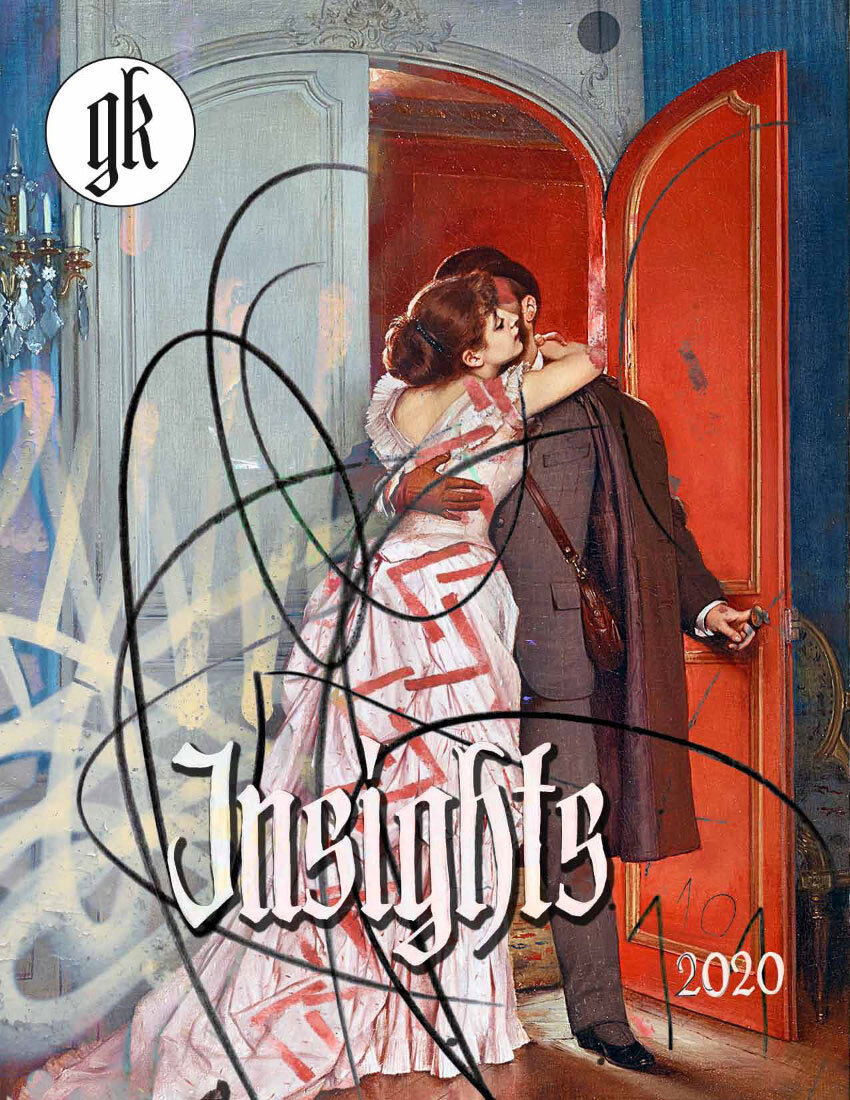
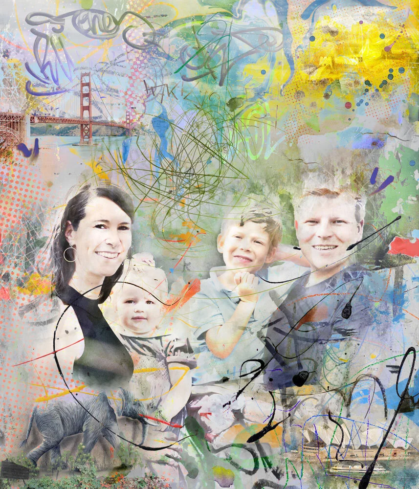
The original photographs for this work have been subtly revised so that photographic details are easy to recognize, but fine, abstracted so that they fit well into the overall composition. The customer's image requests, a portrait of Sissi + Franz, Fuschl Palace, Schönbrunn Palace and a photograph of Verona were integrated into the overall ensemble and arranged so that the photographs formed the basis in the image structure, the foundation in the lower third of the image and symbolically in the upper one Part of the transition to the symbolic Sissi + Franz figures. Behind it, monochrome fragments of Verona photography keep peeking out. Sissi and Franz are intentionally arranged a little out of the center of the picture, in between, a soft, orderly color element in pink has been introduced, which symbolizes protection and order. In general, a lot of painterly pictures were made for this picture and these were inserted into the composition step by step. Luminous colors, pastel tones and slightly muted colors in the architecture pictures - which are otherwise too "heavy" - alternate and are well balanced. Spray painting, water and enamel colors, charcoal and chalk pens as well as decollages and poster fragments create a good depth in the picture and provide exciting details and create beautiful accents.
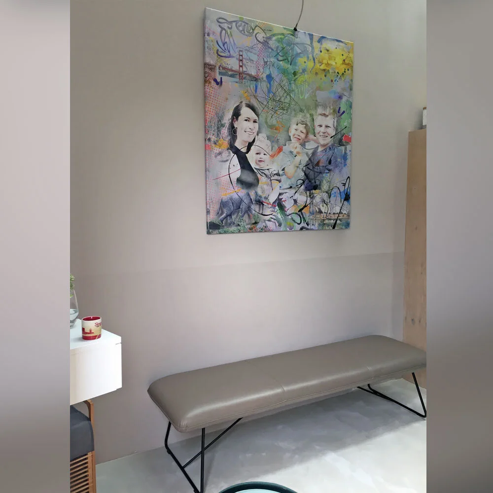
Thank you Nicole and Christian for letting me create this picture for you.